On the Level
Branding a new artisan microbrewery with a sense of place and tradition
On the Level is an independent microbrewery based in Wrantage, on the Somerset Levels. The project came through a personal recommendation, and like many start-ups, with limited funds but huge goodwill and enthusiasm. The client had already spent time thinking through how he wanted to position the product, had experience in the sector, and how branding brings products to life in an incredibly competitive market.
The early focus was on creating a high-quality, distinctive product, and a carefully considered timeline to include the build of the brewery and gradual introduction to the market starting with a single public house, then a chain, and then small-scale retail/wholesale.
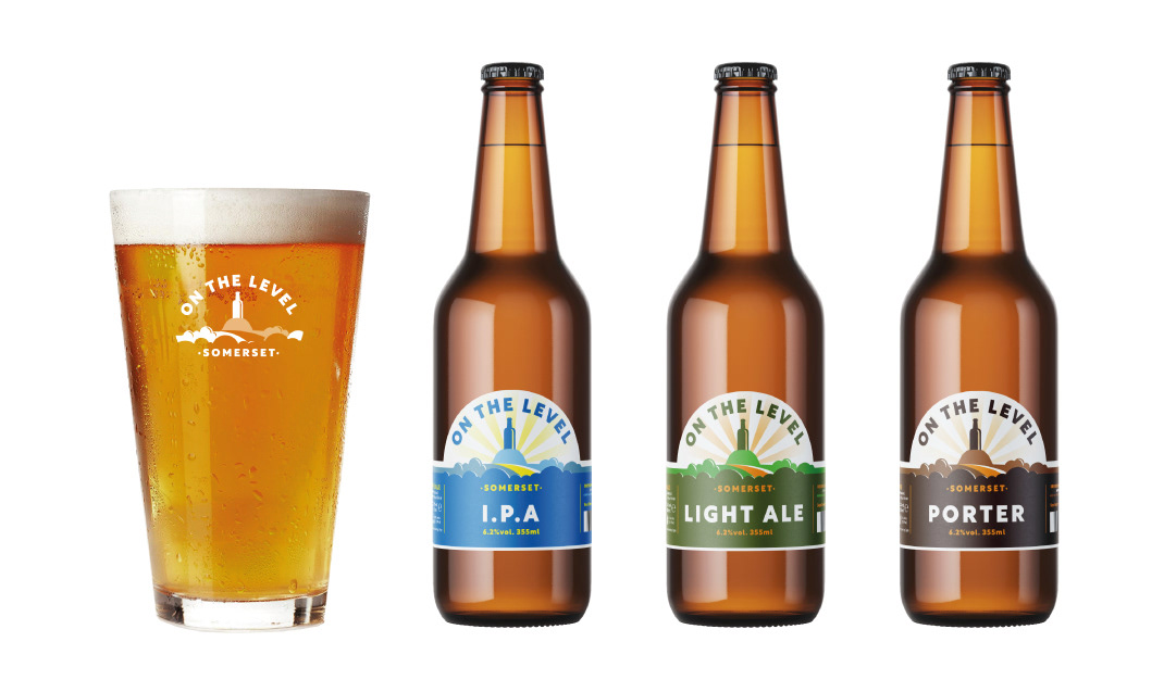
The client had also considered what they wanted to ‘say’ with the brand and wanted it to project a clear sense of place and belonging, creating a modern product, but with a real heritage that could be both a hero product and work well in sub-brands.
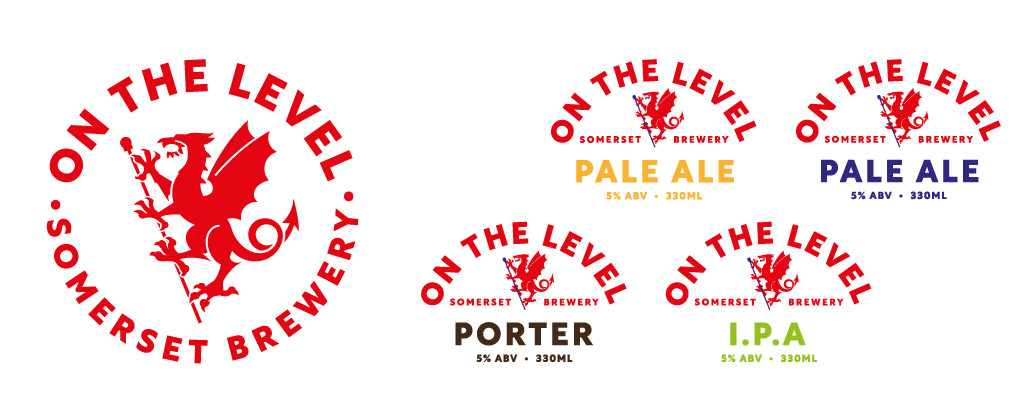
Their first exploration was to consider the traditional Somerset Dragon, with a view to refreshing and championing the motif. The Somerset Dragon is well known locally but being red in colour and very much a traditional heraldic ‘dragon’ I had some anxiety that it may be confused with the Welsh Dragon when seen outside the county. Although dragon motifs are visually strong and work well as badges and heralds, the product had to appeal to both men and women and across a wide demographic, and the typographic element needed to be the hero in retail with plenty of potential product flexibility and range.
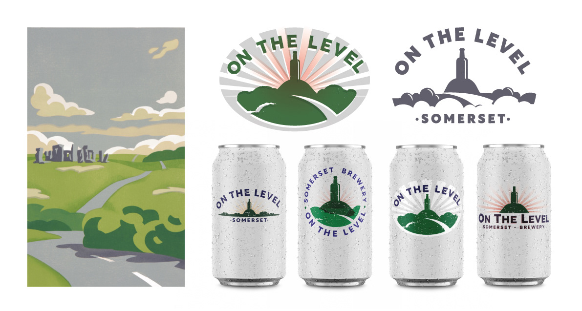
I also suggested an alternative that was a more location-focused concept. There are two key features on the flat Somerset landscape, both hills with Tors (castellated towers) that can be seen for many miles and reference clearly the flatness of the levels and reinforced the humour embedded in the brand name. It seemed logical to substitute a traditional beer bottle for a Tor, making the product into a distinctive, heroic figure. I was also drawn to the visual language of heritage-style travel posters, specifically the work of Edward McKnight Kauffer, which also helped me to develop flexible typographic styling, and a custom colour palette. Researching traditional beer bottle labelling and marketing also gave me shapes, textures and layout ideas to play with.
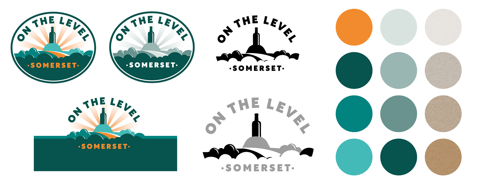
Re-working everything across all potential product types and applications, considering essential texts, graphics and inclusions was an interesting technical challenge, as was adapting the logo to new applications, towels, beer mats, glasses, pump heads etc and through to new product ranges and marketing/social media.
The client was really happy with the results. For myself, I enjoyed being able to mix modern and heritage styling to create something new, adapting the graphics and techniques from traditional posters and products without being a copyist, and the academic challenge of working across multiple applications and platforms.
My favourite feedback comment -
"It’s a new beer that feels like it’s always been here".