Case Study - Dyke & Dean Rebrand
Moving brand language forward
For an established brand to change its pubic-facing identity in any way, there needs to be sound, strategic reasoning, purpose, respect and reflection on who they are, where they are and how they got there.
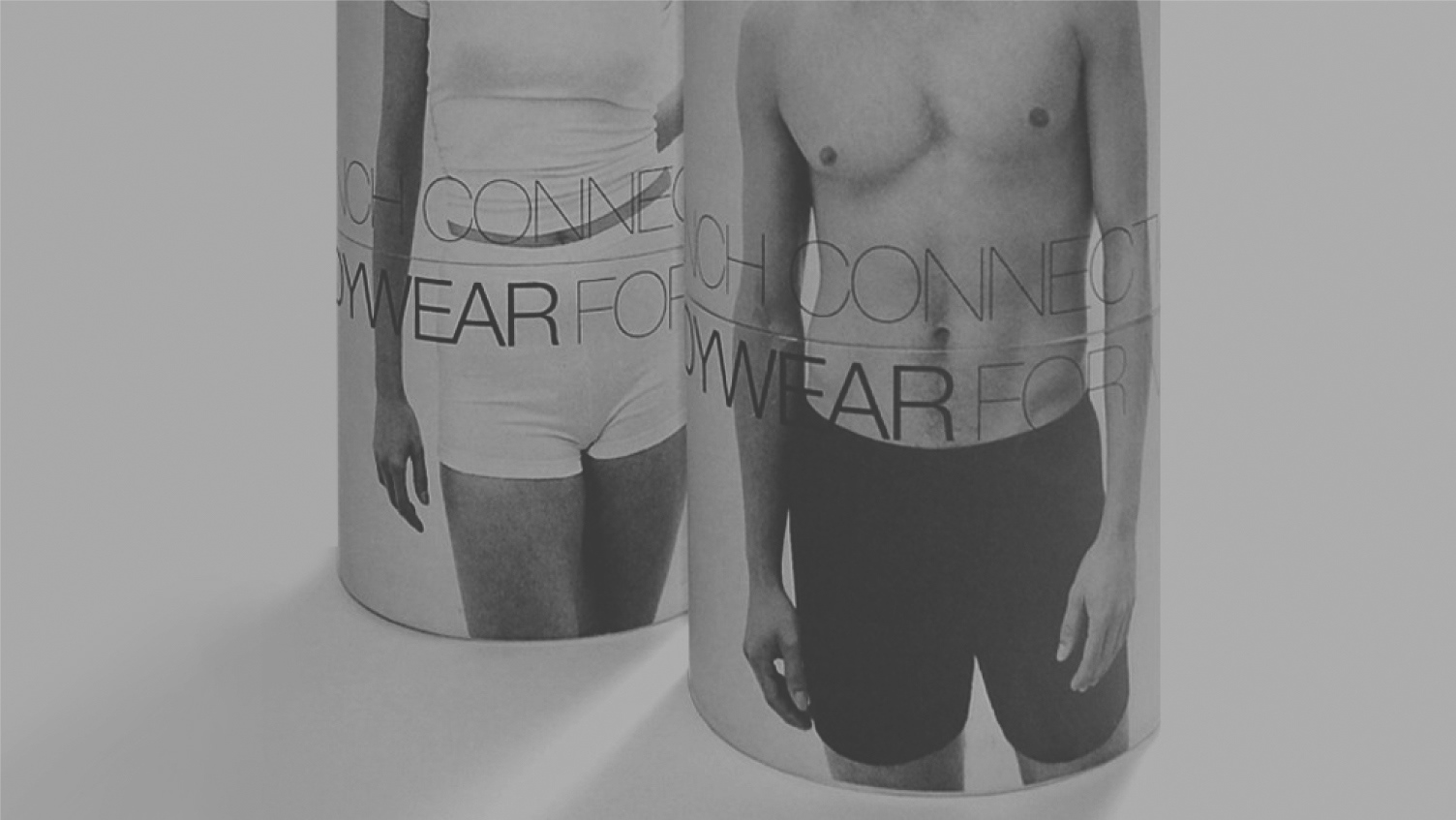
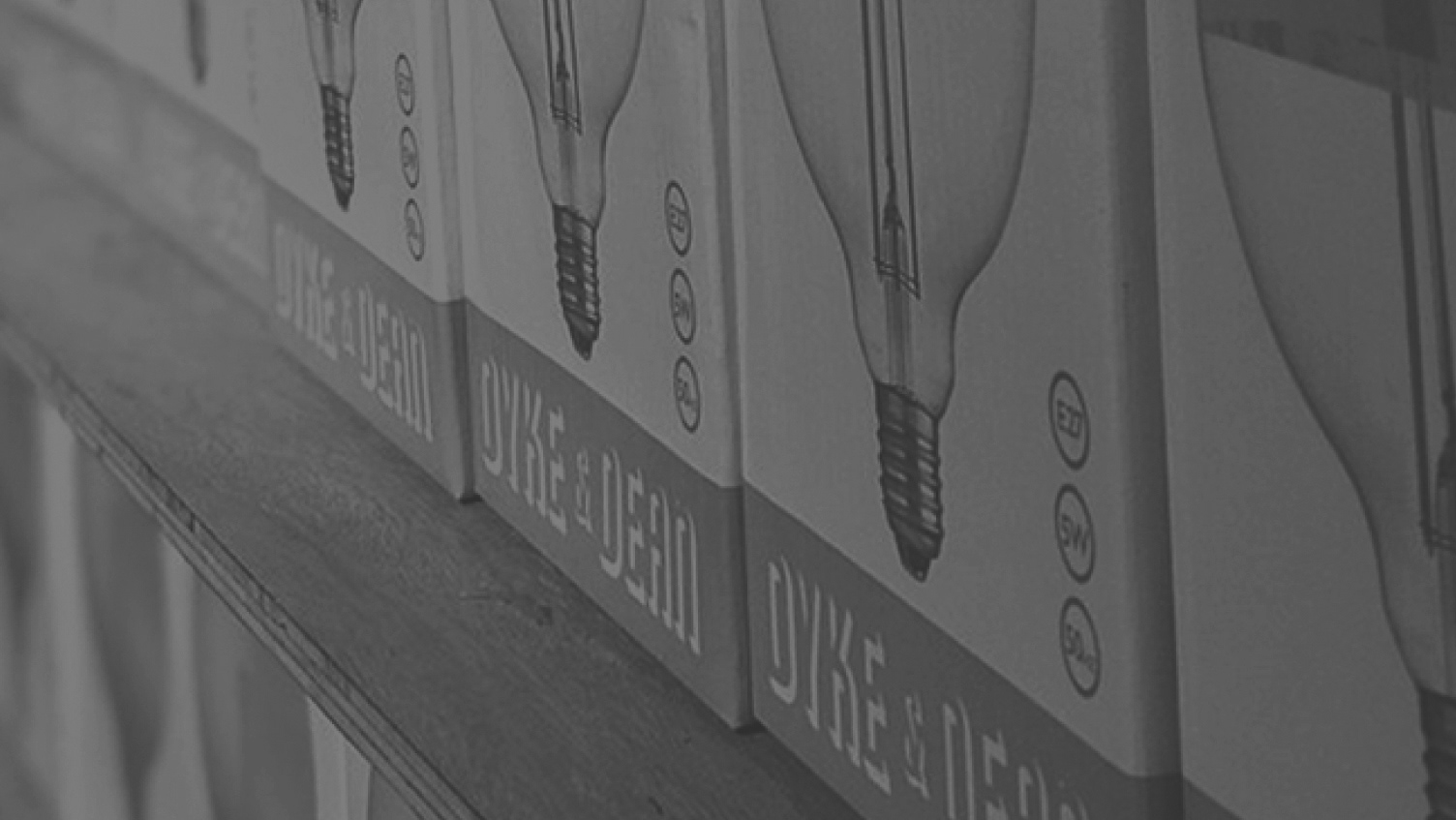
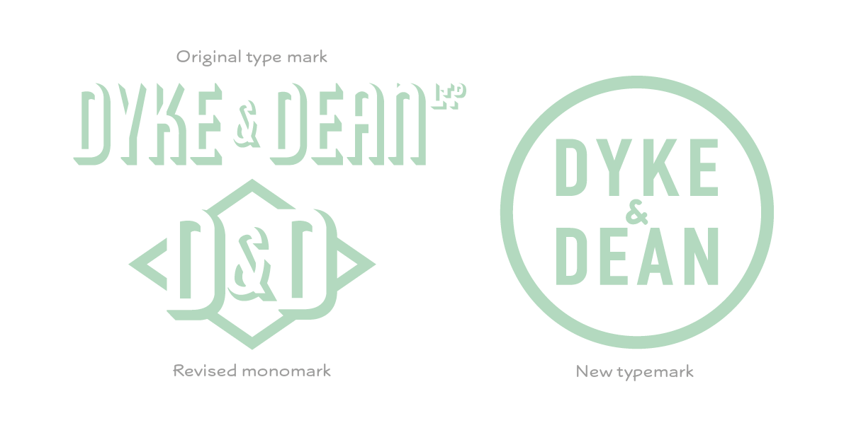
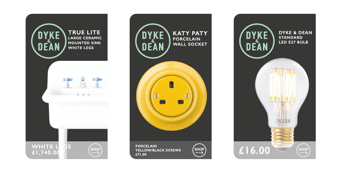
I’ve worked with Dyke & Dean for about 10 years now - taking on the original branding that worked hard to establish their credentials as idiosyncratic, creative and innovative lighting and spacial designers as they evolved into product, retail (B&M and online) and expanded into multi-level design services. Over that time we’ve had to engineer the brand language to suit new platforms, display, exhibition and marketing environments, reduce the scale of the graphic elements and enhance their impact, condensing down to a highly recognisable, unique mono mark and creating a comprehensive visual language for packaging and information graphics that adhere to multiple, ever-changing legal requirements and often complex information.
More recently we looked at the visual dynamics of creating brand partnerships and ‘lock-ups’ with other manufacturers and retailers leading to some serious conversations about the politics of brand presence.
When you need an icon to work just as hard reduced down to 4mm to print onto an enamel spoon, or expand to a complete brand language for global packaging, logistics and retail space - there will always need to be compromises. The existing brand was full of personality, heritage (assumed and real world) and highly distinctive. Copy-cat brands exist in every sector and keeping everything fresh and one step ahead was always a challenge. More complex was the communication with the digital world, marketing and social media, and helping stylists and potential partners to maintain their position in the creative sector.
There were also a lot of conversations about the use of either ‘+’ or ‘&’, and to their credit, D&D include all their staff in discussions and appreciated all feedback, from the customer facing retail space through to the warehouse staff who need to manage, locate and distribute thousands of product lines and packages
Although we never actually sat down and talked about a re-brand - the initial conversation came from the need to create a new, simple typemark that could be added to partnership marketing, so if D&D began working with a specific supplier or agency - their brand and ‘our’ brand would work together in a balanced way and the clarity of communication was optimal. That meant looking back to the full wordmark - instead of the stylised monomark, balancing the existing, distinctive typestyle with something more instant and comfortable in digital use, and crafting a Logotype that was just as comfortable with everything already done but worked seamlessly going forward, no ‘bump’ in the road. The existing brand can live on indefinitely, D&D products are built to last, and the logistics of retail demands that old and new stock must sit together. More importantly, it had to feel like an evolution and not a revolution.
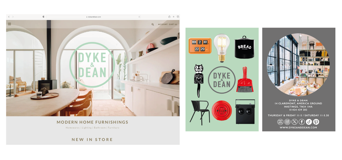
Adopting a new circular enclosure helped draw in existing graphics and was incredibly useful when it came to the more complex information graphics we often have to generate - this includes all the visual communication that goes into logistics, warehousing, stock control and delivery before the customer even sees their product. It also allowed us to ‘own’ the space. How the brand performed on social media and platforms like Pinterest is an important part of their brand presence and the new logo form was specifically engineered to make the most of these spaces, complementing, not competing with the message.
There has already been a lot of testing and experimentation with products and placements that won’t see the light of day for years, but thinking forward is an essential part of the rebranding process.
The new mono mark is slowly being rolled out across product and retail space naturally instead of rushed through in one hit, the customer should barely notice the difference but appreciate the clarity of communication as a natural part of the evolution of the brand.
It has been designed to make new packaging and branding easier, more effective and simpler without losing touch with who they are, where they came from and the customers and partners they work with.