Case Study - Dyke & Dean
Building a packaging strategy for a complex high-value product.
I’ve worked closely with Dyke & Dean for several years now to provide design support for packaging, labelling, brand development, wayfinding, marketing and social media.
Dyke & Dean specialises in high-quality electrical accessories with a focus on lighting for the interior design sector, with their work seen in many public and retail spaces, shops, restaurants and homes. As well as design, implementation and project management they create products and source prestige stock globally.
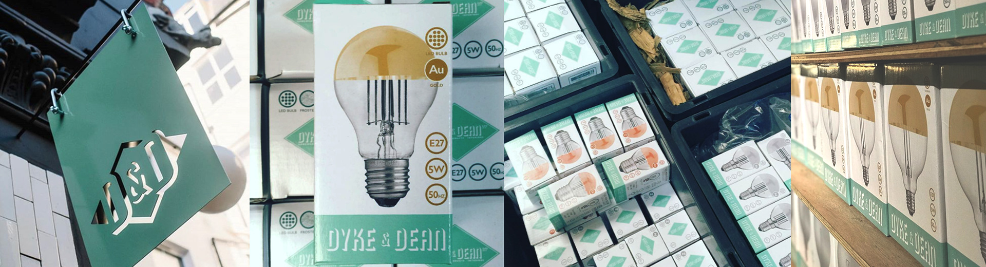
In 2016 we began a conversation about creating a branded range of light bulbs and fittings, to be pitched as high-quality, high-value, premium products. They needed to act as brand ambassadors and communicate who D&D were, and be a natural fit for their existing product range.
An emphasis on heritage was essential but also an understanding of current lighting trends, technological changes, legal requirements and accurate information. The lighting sector is highly regulated and incredibly competitive, and each bulb has its own special features, finishes and performance.
An early version of the information matrix
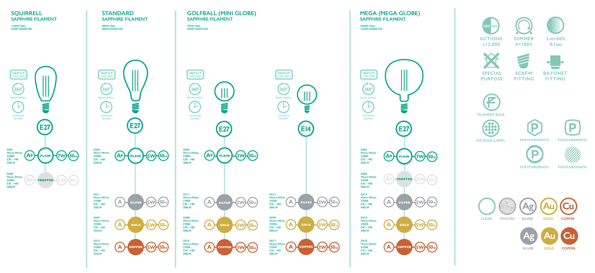
I had to start by understanding the range, all of the evolving technical specifications, how they would be sold and how we wanted them to both champion and grow with the brand.
I wanted these small high value-items to act as brand ambassadors, to be as exclusive as the fittings they were designed for and for the packaging to have as much prestige and desirability as possible, without forgetting that even such an expensive product had to demonstrate value for money. The packaging also had to perform, with each bulb arriving at its destination in one piece, and with manufacture in China and supply global, that’s quite a big ask.
I built a detailed database for each product
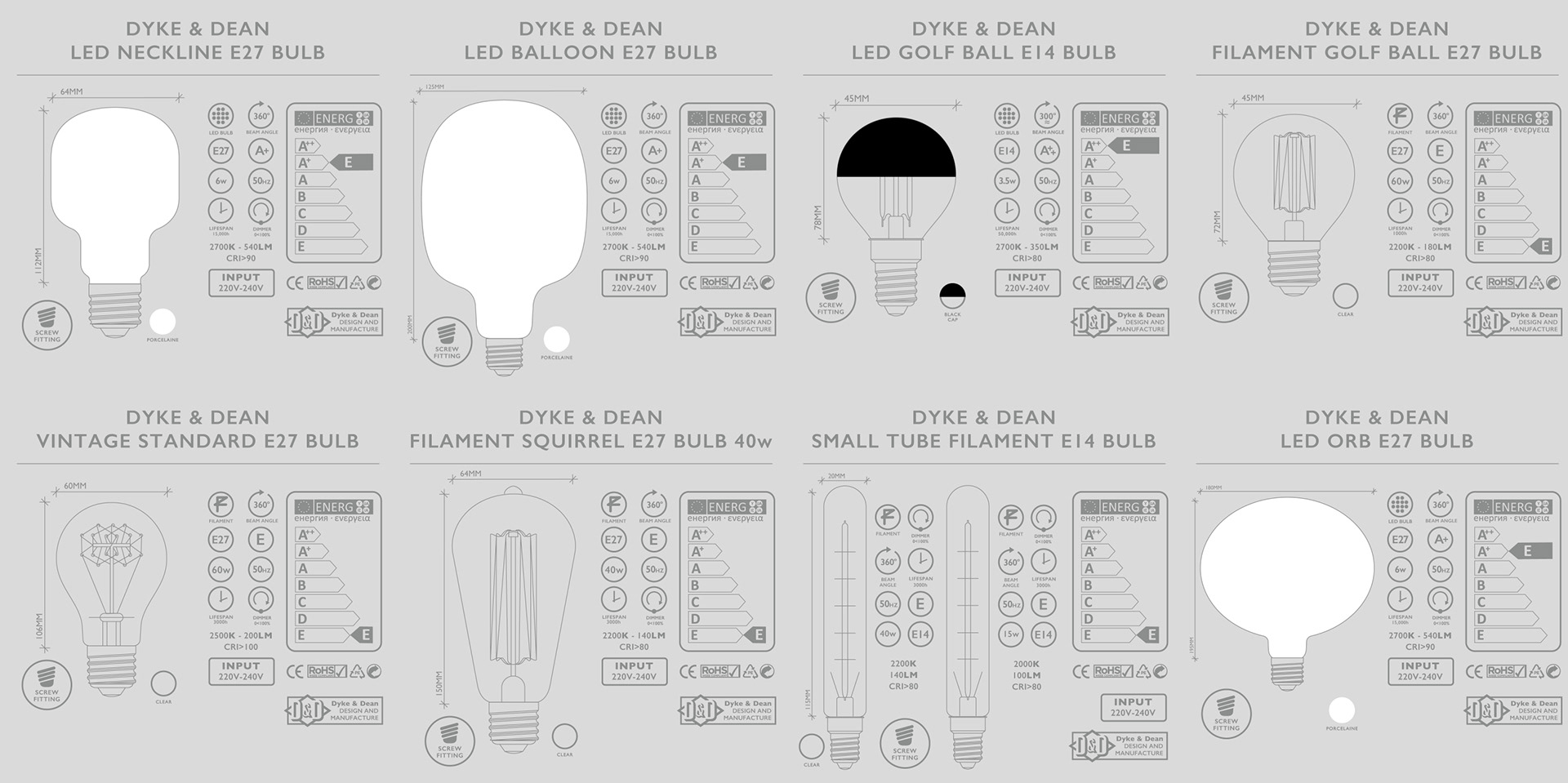
We’ve already built a strong, cohesive D&D brand, so I had something to build on. The heritage aspect gave me a starting point, researching mid-century electrical packaging and branding, but I realised I had to create an entirely new visual language for all the essential technical specifications including shape, size, fittings, finishes and a host of other obligatory references.
Creating the initial design was easy, for me - the product is always the hero, and the special finishes and colours for each bulb gave me the ‘palette’ I needed to start building a brand language. I designed an iconography that was clear, communicated well and held the technical specifications as a priority. With such a high-value product, we didn’t need returns through damage to the product or package, or left-on-the-shelf seconds, the customer had to get the right bulb every time in perfect condition.
We started with a small selection of bespoke shapes, sizes and finishes as the groundwork for a range that could grow and embrace new tech, filament types and shapes as they become available.
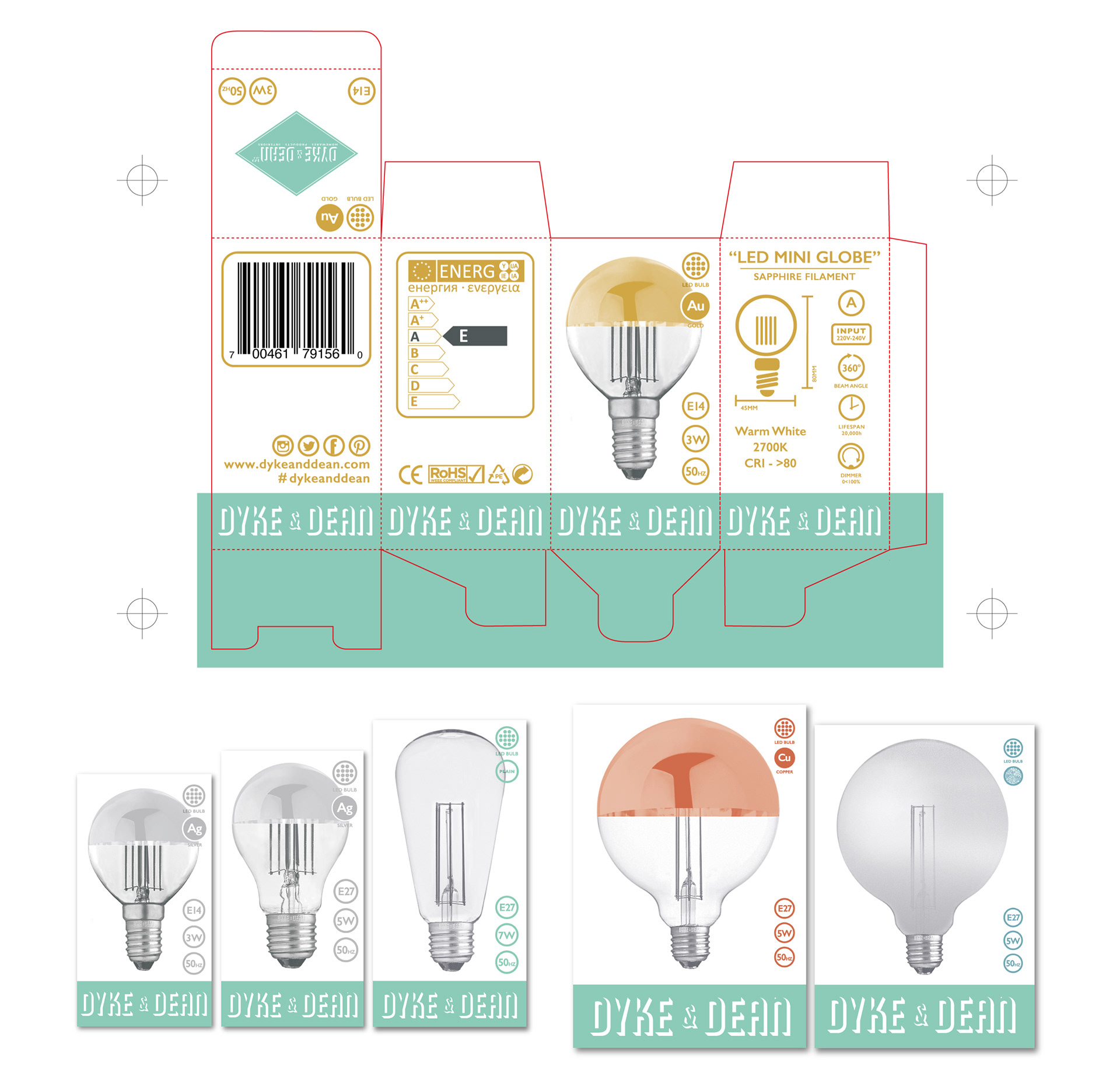
Fortunately, suppliers have done plenty of work to create robust substrate and packaging tech, so I was able to make fairly straightforward decisions early on creating the templates and concentrating on pitching the ‘look’ and communication. D&D already had a robust brand language and colour palette, so we commissioned photography of the bulb range (not as easy as it sounds) and realised quickly that the special finishes such as frosting, colours and metallic coatings were easier to achieve in post-production, so I created a system with Photoshop templates for everything and concentrated on getting perfect ‘base’ images, adding colour and texture later, and adopting a simple 3 colour print process to get the right level of accuracy with limited colours applied directly to a card substrate, making the look and feel of the manufacturing process an integral part of the offer.
Building a graphic language was more of a challenge, aside from statutory content, barcodes, energy rating graphics etc, I need a working international visual language. I had to consider bulb shape, fitting, lifespan, luminescence, power ratings, and even a standard number of times the bulb was expected to be used. I created a working matrix that suppliers, buyers and factories could easily reference with the capacity to evolve. For myself, it needed to be beautiful, there is no excuse for seeing technical information as an afterthought - it’s an essential part of your brand message.
After multiple rounds of changes, adaptations and improvements - the first set of prototypes was printed digitally by PrintBig in Portsmouth, who had the technology to print, cut and fold the prototype packaging in-house. Not the cheapest way to start production but it gave us the opportunity to review the product and gauge the customer response, which was very positive. Typically for this industry competitors immediately started to ‘mirror’ the design - usually an indication that you’ve got something right. Production now is China-based with the artwork generated here and a detailed working brand book to keep everything on track
The bulb range has expanded over the years to include many more shapes, filament types and technological advances (primarily the emergence of LED and energy-saving features) and now specialist tube lighting to compliments D&D’s own custom-made fittings. The packaging has proven to be popular, robust, economical and efficient - and best of all - people like to keep the boxes! Always a big win for me as a packaging designer