Redesigning a local newspaper (almost)
The general theme of the last year has been pitching for new work, getting to the final two then losing to the other guy! Most recently it was to take on the role of design and art director for a local newspaper. I’ve always wanted a project like this so it was a big disappointment to be pipped at the post. Possibly I was a bit too vocal about some of the changes I wanted to make!
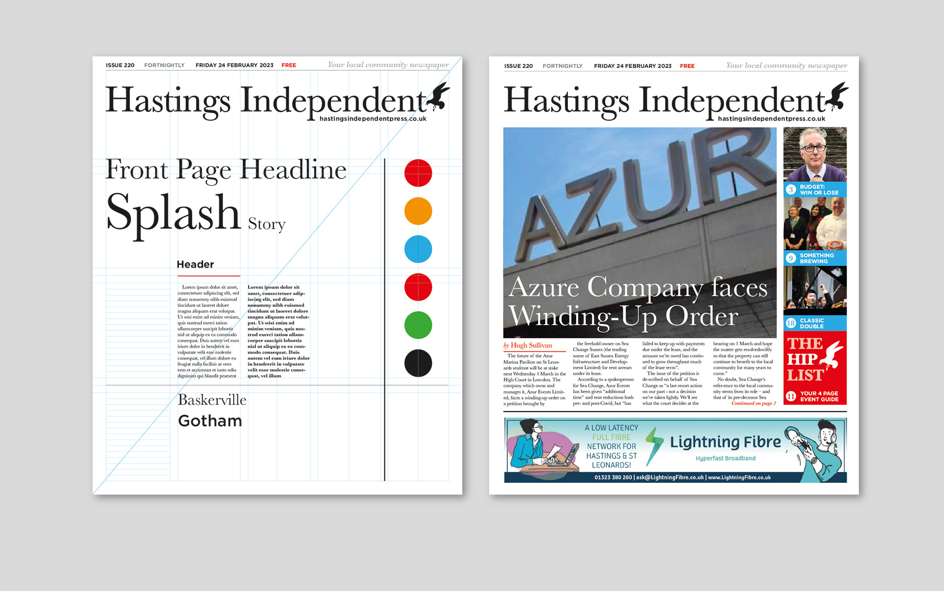
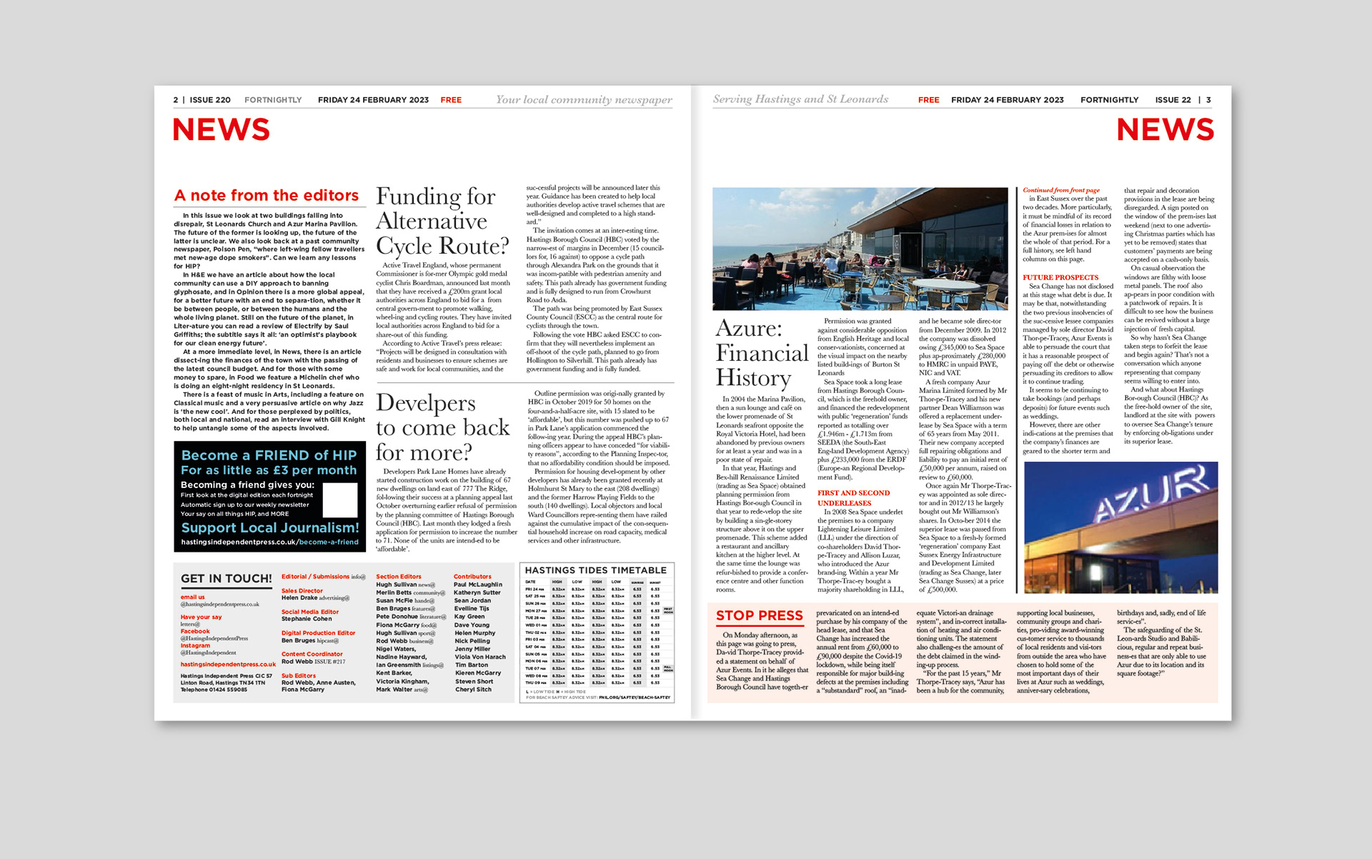
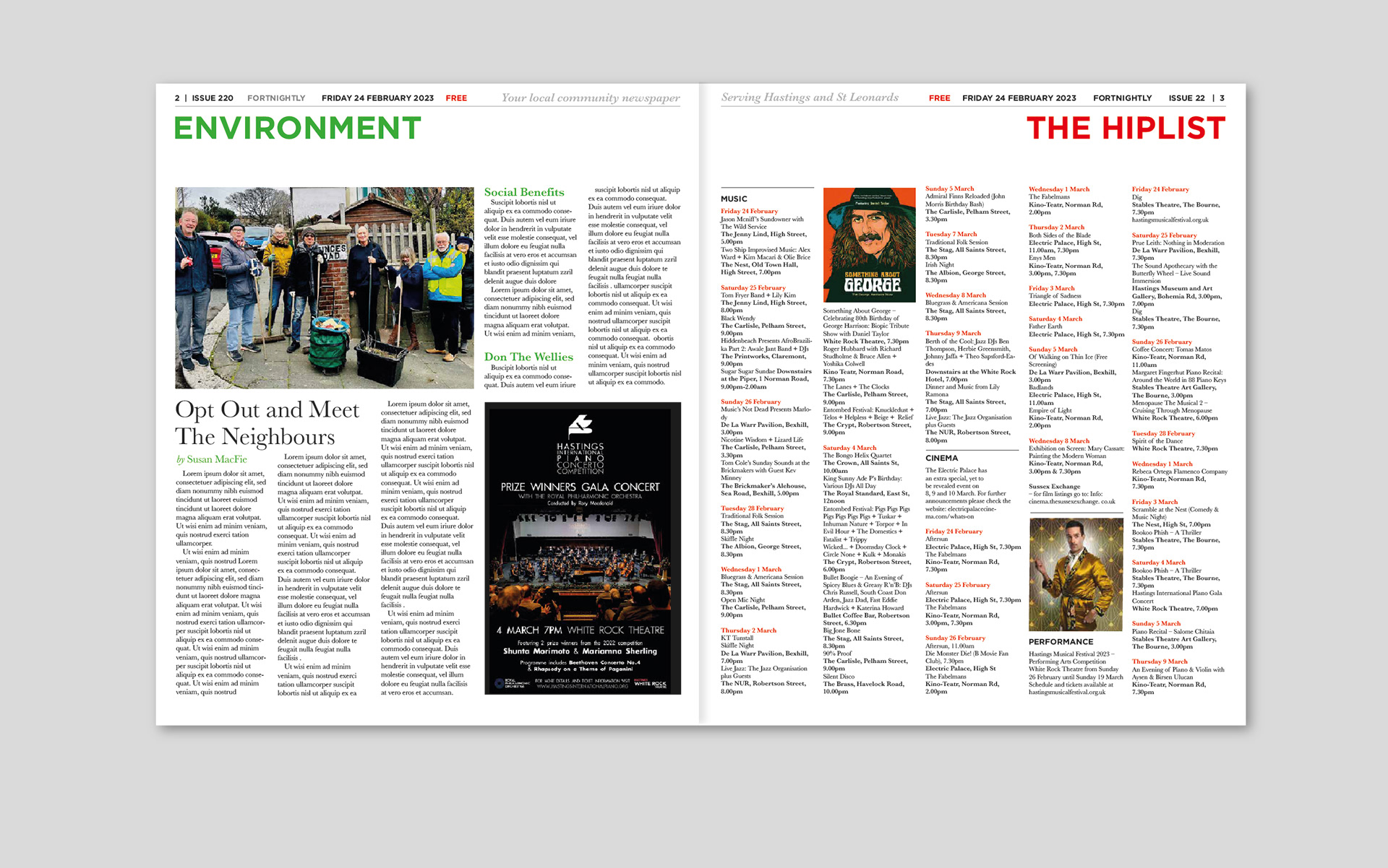
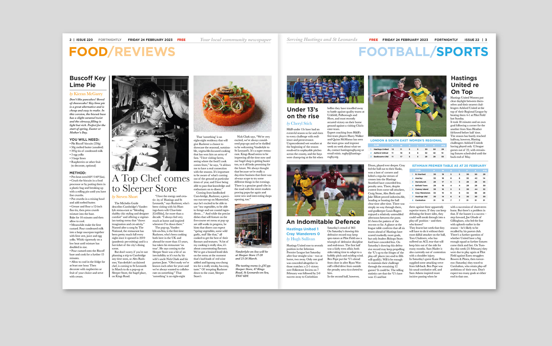
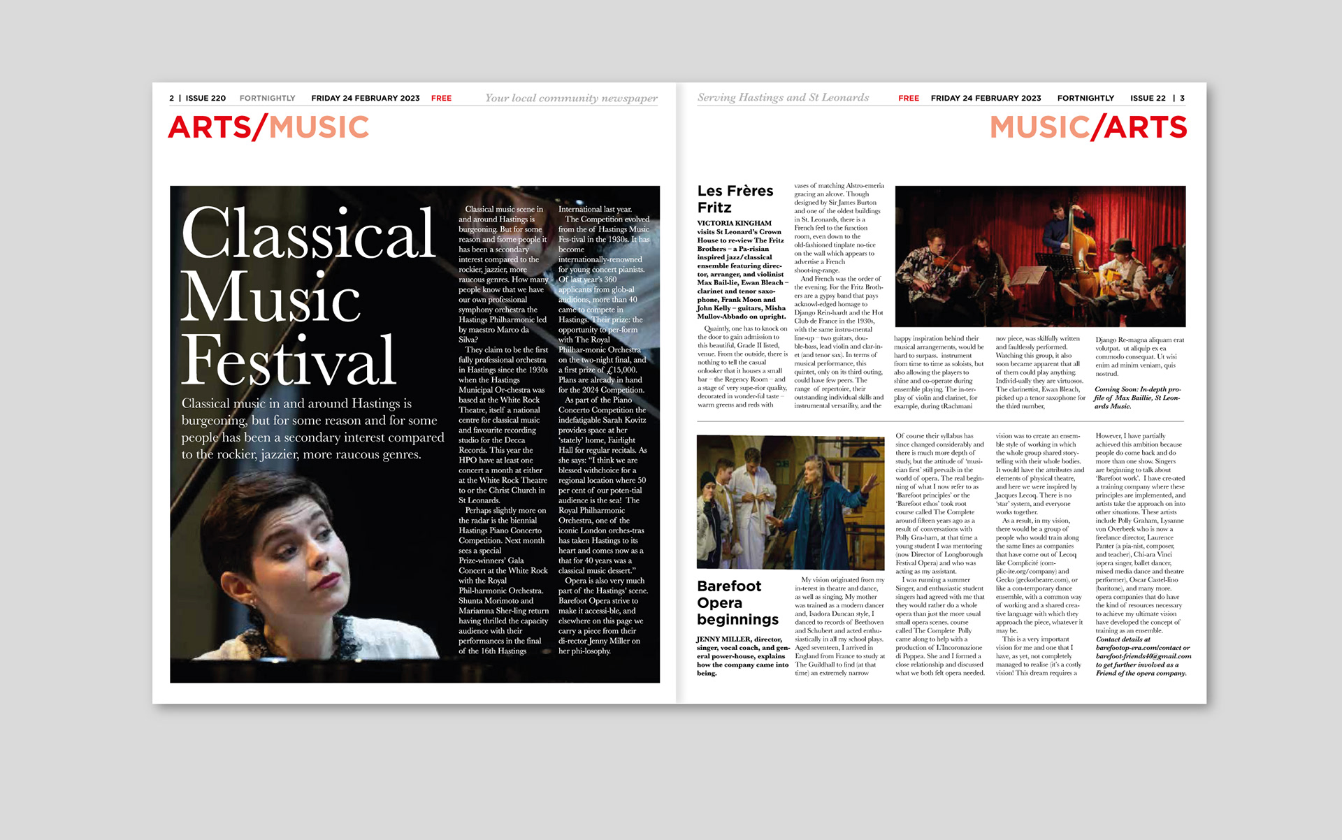
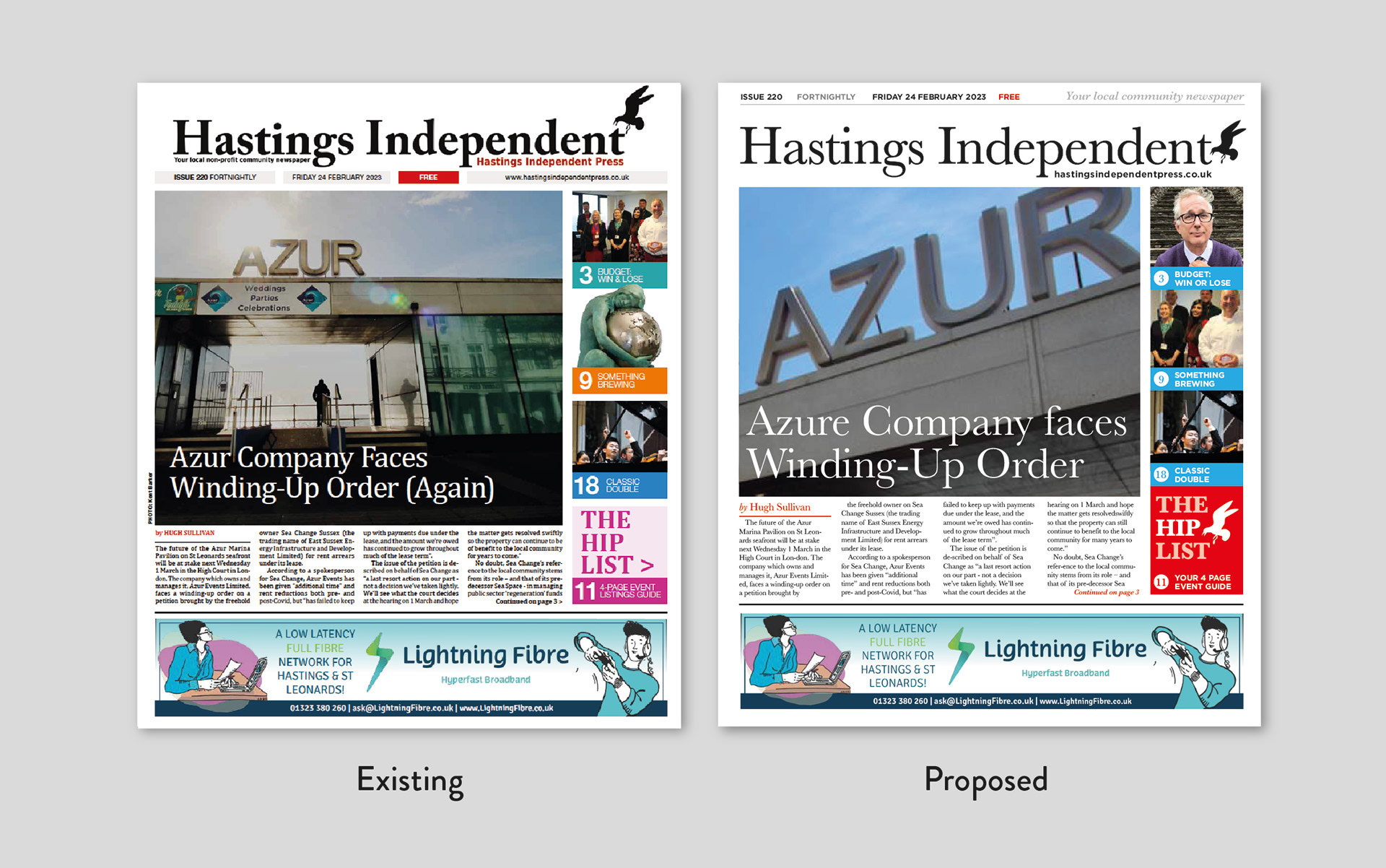
Looking at what they already have, I think the existing layout looks too dense and feels patchworked together. I wanted it to feel more editorial and be more competitive (this is a free paper in direct competition with a well-established local weekly and survives on advertising), and for myself, I’ve always wanted to take on the responsibility of an entire fortnightly publication.
So, instead of brooding - I decided to just go through the process as a personal project. Improving the masthead, layout and general texture of the pages. Finding better use of space and navigation and giving everything a more considered, modern feel.
I’ve worked up enough spreads to be a good prototype and case study, I’ll probably revisit and refine them until I’m happy. It’s a useful discipline and I’m happy with the results, and I’ve always wanted to work with Baskerville properly!