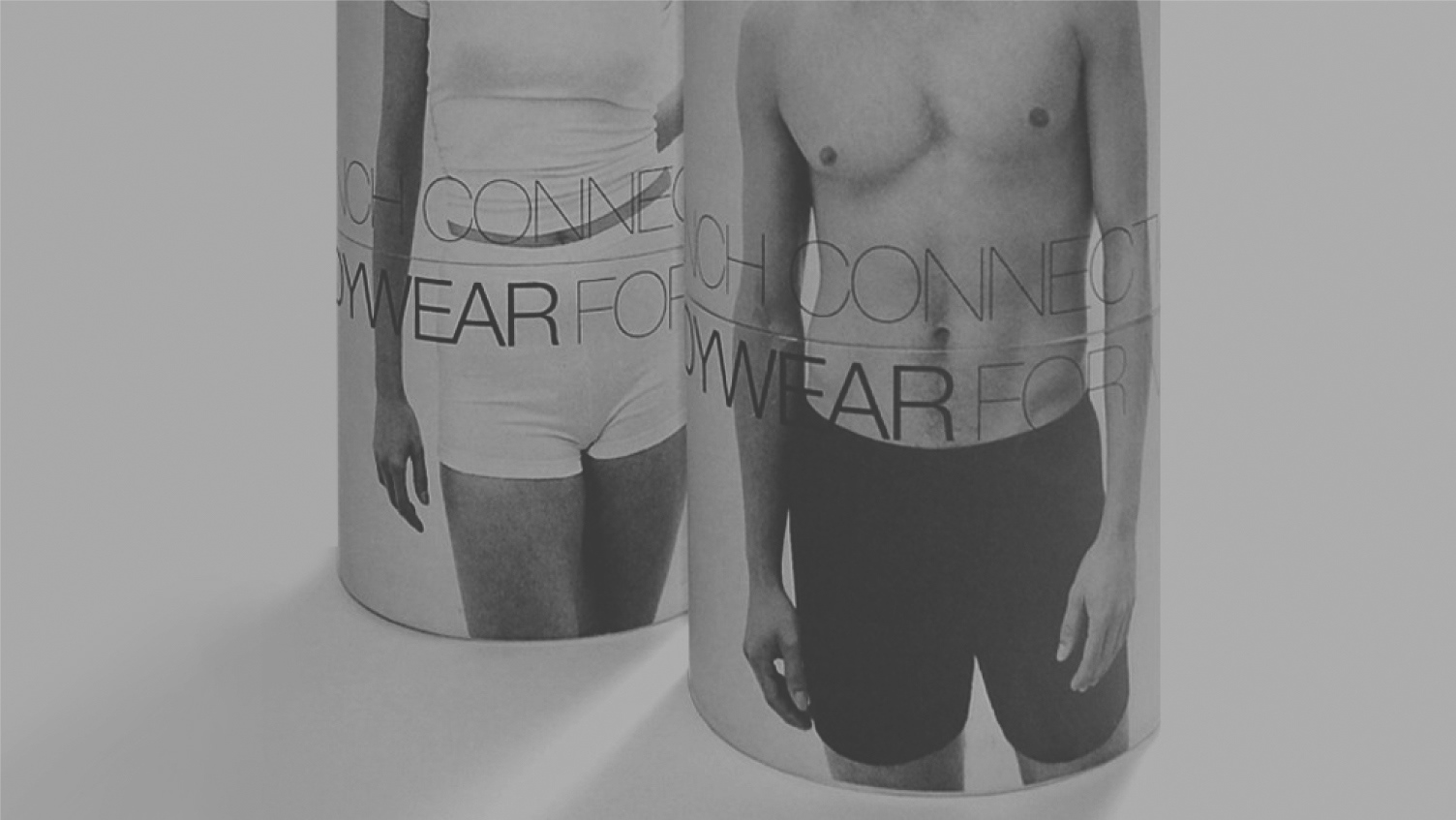
FRENCH CONNECTION
I started freelancing for French Connection in ’95. I already had plenty of experience working in and around the fashion industry crafting design solutions for a range of brands and manufacturers and a colleague at another company had brought me into FC when they took up a womenswear position to look at solutions for underwear packaging.
At that time, all the graphic design was managed by Din Associates (under Valerie Wickes) but there had been a move to bring everything in-house for a while. I was invited for an interview and was more than happy when I was offered the role. The best part for me was that I had no precedent. All the work would be brought in-house to me, and nobody really understood or had any experience in what I was doing, so I had a blank slate. I liked working with fashion industry professionals and I loved the brand. At that time there were the core Menswear and Womenswear divisions, a small childrenswear department, Great Plains, an entry-level basics brand and Nicole Farhi, the high fashion sister brand, all under the same roof in studios above the warehouse in Bow Road.
There was a fantastic working culture, the company was still small so internal communication was great. It was pre-digital so work was more hands-on with hours at the fax machine, on the phone and hand-drawn specs and designs, but there were robust systems in place, and everyone knew, understood and loved their job. Importantly, everyone worked well together. On the downside, I realised on my first day how little understanding there was of what I was going to do when I was presented with a blank desk, blank looks and nothing else. The first thing I did was get a cab home to pick up my own computer - a Macintosh LC11 with a very small CRT monitor, early Adobe Illustrator, Photoshop and Quark Express. At that time design software worked in wireframe/preview-only mode so work was laborious and slow-paced, so you had to focus.
Another task was getting people to know what I did so they could channel the work to me - and that meant talking to people, understanding and respecting what they did, and making myself useful. It wasn’t long before I was creating labelling, packaging, prints, T-Shirts, advertising, marketing and retail display graphics. I managed all y own time and budgets and I coordinated with both PR divisions (NF/FC) and the retail design team at Bow Road (managed by Tony Humphries).
I’m not naturally an In-house person but I was very happy working with FC for 3 years, a fantastic professional opportunity and I was able to develop the working methodology that has driven my practice ever since.
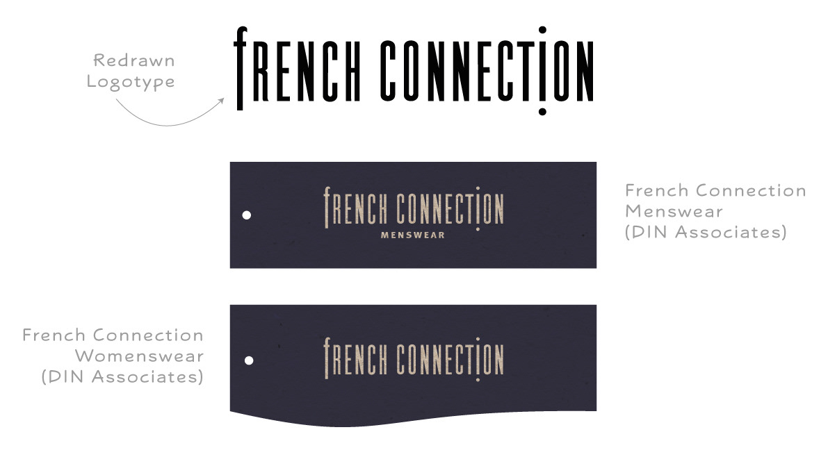
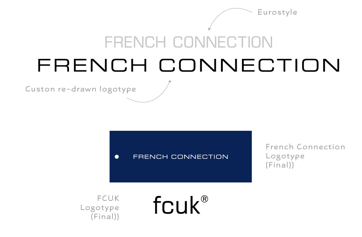
One of my key early projects was the full rebrand of French Connection. I started by re-branding Great Plains (almost by stealth). The existing logo used a faux typewriter script and didn’t really reflect where the brand was going. My starting point was a free font from a give-away floppy disk that was supposed to resemble Eurostyle but was poorly drawn and incomplete. With no budget to buy fonts I re-drew the letterforms myself and created something closer to the mid-century magazine feel I wanted to achieve. Everyone was happy with the result, and being in-house I was able to manage the creation of ticketing and labelling and see first-hand how merchandisers were responsible for the distribution of assets and instructing factories with basic brand guidelines.
At the same time I had already taken the existing French Connection logo (unattributed but probably Din Associates) and stripped the colour for a mono mark, redrawn from a tracing (there were no digital files for anything) and began the work of slowly getting people comfortable with moving forward. The existing labelling was dark blue ink on a greyboard with a curved edge for the womenswear ticket (very unpopular in the office, it felt dated and was considered sexist). I really wanted to move from blue to black as a significant number of bags and tickets were rejected by QC - the blue was difficult to match and always inconsistent, and streamline the multiple ticket styles down to just one.
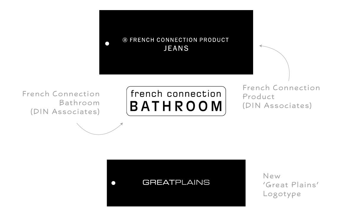
I’d already experimented with a lowercase version of the logo in a Eurostyle font similar to one used in the small bathroom range (again by DIN) which I was able to re-draw digitally and adapt, and then eventually drew my own uppercase version of French Connection and bought in samples of tickets and woven labels for testing.
The responses were very positive from the start. It moved the brand forward and gave us a crisp, modern, European feel. I was never able to move fully to the black base only (that happened after I left) but I got very close. There was already an existing sub-brand for jeans called ‘PRODUCT’ with a Franklin Gothic wordmark that I was able to absorb into the main brand by using a black base label and we would use a white base internally for samples and prototypes.
It took 6 months (a full season) to distribute labels to all factories and suppliers, ensuring a coordinated launch across all brands. The new woven label range was streamlined and of much higher quality, upgrading all products instantly. We even made them more prominent on the garments, the customer loved them too.
The only criticism came from a director who thought the name was ‘too long’, but they were satisfied when I pointed out it was still shorter than Dorothy Perkins at one end of the scale and Costume National’ at the other. The FCUK motif had been developed internally at the same time and I used the new font in Lower case. It was an important wordmark development because it made better use of hanging signs and small spaces before it ever appeared on garments or advertising.
Over the years there have been several attempts to alter or upgrade the main logo, but none of them worked. It’s still the logotype I drew painstakingly on my tiny, primitive Mac in the Bow Road office, and I’m still incredibly proud of it.